


Do You Dream In Colour?
by Richie
 Has a lifetime of gaming fucked my eyes or has there been a distinct lack of colour in the gaming world for a while now? I was raised by a sentient ZX Spectrum that had a display capability of eight colours (fifteen if you include the BRIGHT variants, six if you don’t and you lose black and white) and while it wasn’t too clever with throwing those colours around too liberally, it always had a bright, iconic look to it with games like R-Type, Myth and Jet Set Willy punching above the console’s weight to deliver bright, vivid looking games. The you had the wonderful world of the SNES and Megadrive consoles. Hundreds of colours tantalising your eyes, even if it was usually via the medium of the cutesy platform game complete with mandatory slippy-slidey ice levels.
Since then, technology has given us 64-bit colour. I don’t know what that means, I’m not Stephen Hawking, but I know it’s a lot. The Speccy and Commodore 64 were 8-bit so it’s at least eight times that. Or something. So why is it that all the modern, supposedly triple-A games look like fucking Poland? Gears of War with its imposing greyscale palette, Call of Duty, which seems to be exclusively mud-brown and camo green, and Halo, which looks like dogshit at the best of times. I don’t need that nonsense. I work in an industrial hell-hole as it is and the only colour I get to see on a daily basis is the garish tracksuit of the nearest inappropriately-dressed street chav.

A recent example of modern gaming’s obsession with bleak visuals can be seen in the Far Cry series. Far Cry (the original PC game, not the console abortion), was set in a lush jungle environment with bright, blue skies and vibrant green lands. It was sort of like being in the movie Predator, but nicer and without the homoerotic undertones, and with the best game engine of 2004 under the bonnet it looked absolutely jaw-dropping. So when the ‘this-gen’ sequel came out, I was hoping for more of the same. What did I get? An entirely beige trek through the shittiest bit of Africa. That is exactly what I’m talking about.
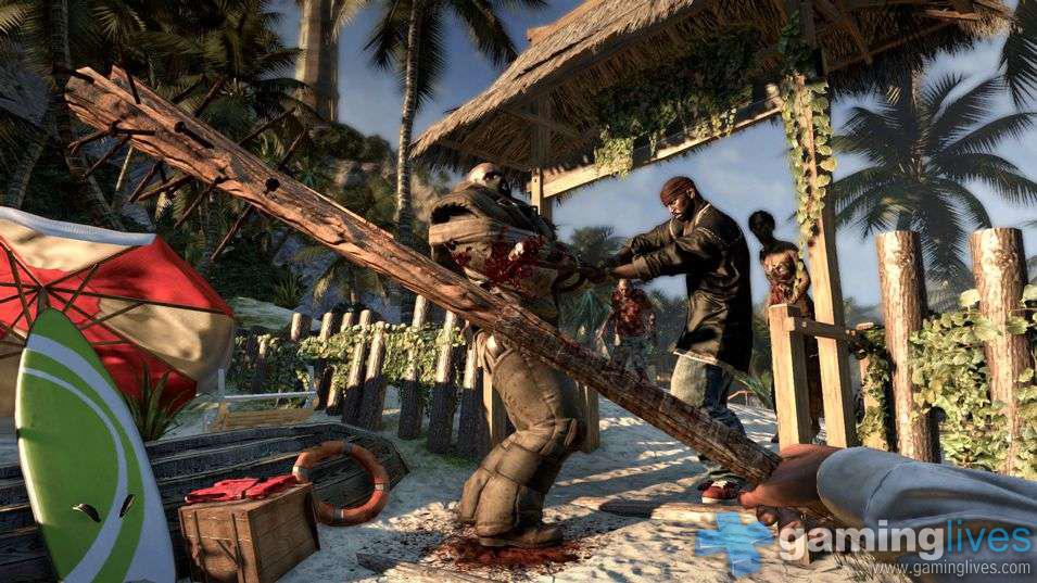 The reason for this is probably modern developers and their obsession with realism, and I get that to some degree. After all, no amount of sweet, sweet narcotics will make the real world look like Rainbow Islands (unfortunately). Instead everything looks like Condemned. But with more cocksuckers in it. Then again, realism shouldn’t be seen as the be and and end all. After all, I’m not a space marine, my hometown isn’t being invaded by zombies and I’m not currently a world class racing driver. Brief respite came from the rather wonderful Dead Island. ‘Rather wonderful?’ Yep. Really. Despite featuring an enemy type so fucking dull that even hating them has become a cliche, and being a lengthy sandbox affair (literally the thing most likely to make me hate games, given that I like them to clock in at around four hours long before I start to get irritable), Dead Island rocks the cock off of your body before resurrecting it with Haitian voodoo magic and having it chase you all around luxury beach resorts.
The game had plenty of positives, but the best thing about it for me was the setting. Sure, the strong story and eminently sliceable zombies get the plaudits but I mostly enjoyed having a full, vibrant palette. On the day where Gears of Grey 3 gets released to a baying crowd, I find myself looking back at Dead Island in full technicolour. The blue skies, the white beaches, green trees and the spewing red blood. It was so bright. So lovely – just like games used to be – but even Dead Island goes the way of all the other games, and eventually leaves the resort and moves into Resident Evil 5 territory before practically discarding colour altogether during it’s bleak final act. Yes, it apologetically gives up on the bright hues, giving modern gamers exactly what they are used to instead… a thousand shades of grey.
 The last console to really embrace the retro gamer’s love of colour was the Dreamcast, on which cel-shading was extremely prevalent. Cel-shading is something of a lost art usually reserved for the occasional Xbox Live Arcade title these days, but one that got a recent boost was 2010′s game of the year, Borderlands. What would have been a lousy trek through the deserts and valleys of Pandora became a vastly more colourful one thanks to the sumptuous visuals that eschewed detail for the bright hues of cel-shading. Other examples in the past have been the barking mad J-pop skating game Jet Set Radio, the odd racing game Auto Modelista, which looked absolutely phenomenal but played like Gran Turismo (that is to say it was, literally, zero fun) and, most recently, the cartoon-stylings of Street Fighter IV.
Consoles will continue to become more and more powerful until they decide that we are all the enemy and wipe us out in a nuclear fireball, and so games will only get more and more realistic, mimicking our drab world and assaulting us with the visual equivalent of a Coldplay song every time we play them. The days of trying to crowbar real world environments into a system that struggles with anything beyond primary colours is over and sure, you can have all the particle effects, pixel shading and whatever else, but don’t come running to me when the colour receptors in your eyes devolve into fucking nubbins.
Last five articles by Richie
- The Richie Report: Et Velum Ultimum
- Sky Force Anniversary - Review
- Pac-Man Championship Edition 2 - Review
- The Final Station - Review
- Ninja Pizza Girl - Review


In your own words Richie, this was unfuckwittable.
Too long have games of the modern era been focused on using the amazing processing powers afforded to them to make drab and dreary looking games, when we could have such colourful delights that the Wii is often forced to do to make up for it’s lack of power. (See: Mario Galaxy, Skyward Sword, Wario Shake Dimension)
While I agree with your views on drab and dreary, is nostalgia not clouding your judgement somewhat? Im thinking of Beneath a Steel Sky, the command and conquer games and the original Prince of Persia (think his blond hair was the brightest colour in it excluding the palace scenes) to name a few. Just hits a tone that people are looking for. Gears of war would look absolutly ridiculous in bright colours because the whole game is about death and apocolyptic ends.
Perhaps rather then bemoaning the lack of colour we need to ask why the perception that bright primary colours = ‘ fun and trivial’ persists in the gaming world? Games like Portal and even LA Noire prove otherwise. They are frigging fun but sure as hell not trivial. Indeed in the new Portal they exercise colour contrast really well as you move through levels.
Its not just an aesthetic there to show off game power. its about setting a tone. I think it’s more about lack of imagination then it is about striving for reality
I like this guy!
Nostalgia clouds my judgement on everything probably.
There are plenty of examples of colourful games (just as there are plenty examples of monochrome games from the 80s). I’m just looking at the overall trend and using it to have a moan. Dead Island was a great example of the trend because it starts of being tropical blue and ends up prison grey.
Ed, ta!
[...] Do you dream in colour? [...]